Logos & Graphics
Graphics I created for business and fun; skills slowly developed over years which I would use to build a game.
8 minute readEarth SVG
When I created the earth graphic in 1999 I soon realized it would become the logo or symbol of my new domain, unsaturated.com. My salad days of graphical dabbling focused on raster graphics. I didn't know anything else because that's what PaintShop Pro emphasized. Every human factors engineer should look back at his earlier work and learn from that experience. Smack your forehead, shake your head, but always learn.
I used Inkscape to build this logo. In total, the process is very similar to creating the raster version but with SVG it's easier to dissect the process into a series of unions, intersections, or difference procedures. I started with the basic ellipse shape and then added objects which would be used to parse the globe into its constituent pieces.
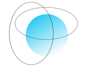
Object intersections and differences yield the final four parts of the globe. These steps were very easy and took only a few minutes. I spent a few minutes on alignment since the process of adding, removing, copying/pasting is rather disruptive.

The green hemisphere of the globe took a bit more work. I'm still learning various techniques to ensure nodes intersect properly. Nodes are the points that define a shape. Paths, which are defined with a sequence of nodes, are harder to manipulate. Like so many problems there are often multiple ways to get the same result. Finally, adding a dash of color finishes the job.

Redline Advertising
My friend needed a logo for his class...and fast. In under one hour I whipped up this gem and set a personal best for quality and speed. We discussed the merits of using a tachometer but he was adamant. For some people "red line" can only mean one, inevitable logo.
The whole design is too contrived. Also, the black text blends in with the black bezel of the tachometer; the gray shadow mitigates the problem only slightly. The tachometer should be cropped off or fade when it intersects with the text.

Somewhere, 2001
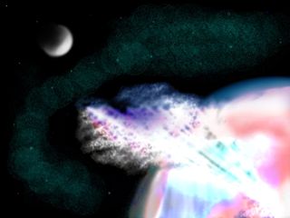
During the summer of 2001 I was interning at Walt Disney Imagineering Scientific Systems. Overall, it was a good experience and the side activities made it even better. The Digital Art Show is held just for employee artwork, so I submitted "Somewhere, 2001". This was my first non-logo design.
Dreamhost T-Shirt Contest
A post on the Dreamhost blog caught my attention. Not so much the title, which declared the "62nd Birthday of Dreamhost", but the bonus for anyone who designed a retro t-shirt: a lifetime of free hosting. Update: the blog post has been removed.
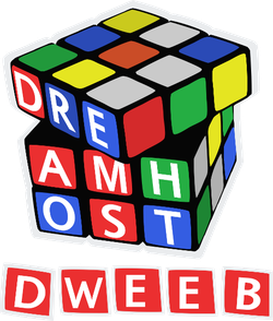
I decided to go with a retro 80s theme. The subject fell into place when I was browsing for kitsch: the Rubik's Cube. Even better was that nine squares (3x3) exactly fits the spelling of DRE-AMH-OST. To finish the design I needed something to indicate this shirt was from the 1980s. In a word: dweeb.
The light gray boundary around the design allows for black or white t-shirts to be used without diminishing the impact of the design. Ultimately, it wasn't enough to win the contest.
Women's History Month
The Women's Studies Program at UCF was looking for a logo to represent Women's History Month 2000. I won the logo contest and got a $150 gift certificate to Barnes and Noble. That bought approximately 1.5 college textbooks for the next semester.

Earth 3D
I decided to take the 2D Earth into three dimensions. But where does an artist find an affordable 3D editor? Bundled on a CD with his video card, that's where. What kind of quality should you expect from such an application? Not much. After hours of adjusting primitive objects I had a new appreciation for 3D modeling. Every aspect came together except for the color gradients.